Just Launched! — Better Product Management Analytics
What feature is next? How many new ideas came in last week? What is the status of a key Q3 goal? Exporting data and doing spreadsheet gymnastics each time you need an answer to these product questions is not efficient or effective. You need a better product management tool. One to manage and report on the team’s plans and accomplishments so you can quickly analyze data, make decisions, and drive your product forward.
Today, we delivered a highly requested update to our pivot tables, charts, and custom roadmaps — giving you powerful sorting capabilities to build and present the perfect product management report.
Whether you want to present the status of strategic initiatives, analyze team productivity, or highlight the most popular customer ideas, you can now do it all from right within Aha!
Here are a few fresh new ways to dig into your product management analytics:
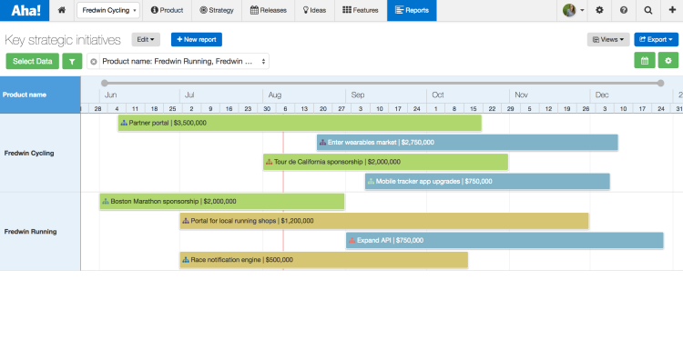
Present the status of strategic initiatives An Aha! custom roadmap is the most powerful way to visualize dates — it allows you to completely customize what is being viewed on the roadmap. This flexible layout makes it easy to keep your teams updated on progress. For example, as shown below, we are highlighting key strategic initiatives by product. Previously, your initiatives were automatically sorted by date. Now, you can sort initiatives by other data fields, such as projected revenue. Displaying your roadmap this way helps keep focus on the most important business drivers.

You now control how data is sorted on custom roadmaps, giving you additional flexibility. You can see that the strategic initiative that is expected to drive the most revenue is listed first.
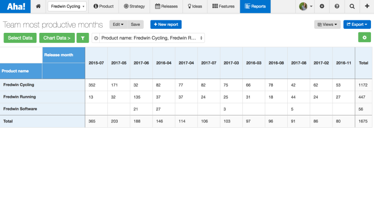
Analyze team productivity by features shipped The pivot report allows you to manipulate data from more than 100 different data objects stored in Aha! It was also upgraded, so you can now sort the data in a pivot report as you wish. For example, you can show off your team’s productivity with a table that is sorted by the number of features delivered each month.

Change how the pivot table rows and columns are sorted using the “Select Data” modal. You can see that the release months are ordered from most features shipped to least.
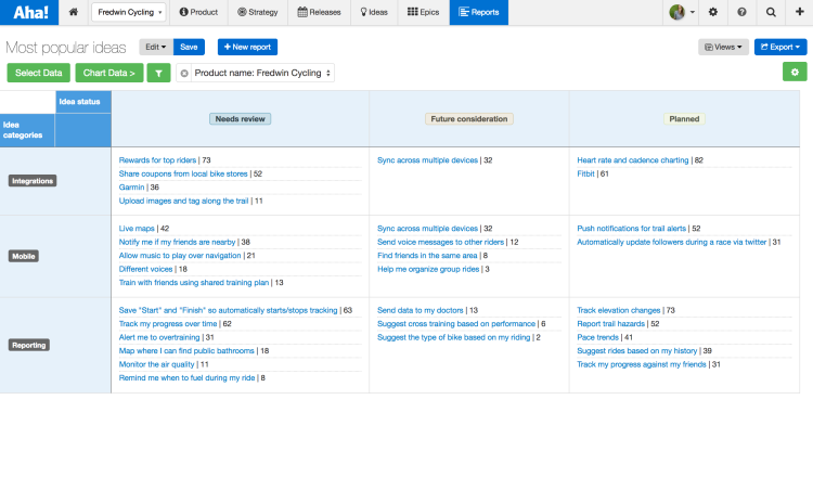
Highlight the most popular customer ideas Make customers happy and build new features. That is the standard goal for any product manager, right? But how do you know which features will make the most customers happy? With your product management analytics tightly integrated with your idea management solution in Aha!, the answer is clear. One report reveals the most popular ideas grouped by category and sorted by vote count. Now, you can promote those that will make the biggest impact on your product.

Create a pivot report showing ideas grouped by category, then sort by the number of votes.
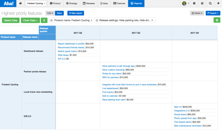
Visualize the highest priority features Reports become even more valuable when you add custom fields. Custom fields allow you to capture the data that is important to your business but not a part of Aha! by default. For example, capturing the expected revenue of each feature in a custom field makes it possible to then report on and sort features by that metric.

Sort by the release quarter and then by the expected revenue.
Point and click configuration Easily customize your pivot table, custom roadmap, or chart. You can sort important criteria to analyze your product plans. Configure your report by first opening the “Select Data” modal. Then, from within the modal, you can sort rows, columns, and cells by selecting the sort icon and choosing what data you would like to use.
Rows and columns can even be sorted by calculated cell values in pivot reports.
You can finally stop the spreadsheet madness every time you get asked a hard analytical question about what is going on in product management.
We think you are really, really, going to like your new-found reporting powers. After all, this was one of your most requested ideas.
Sign up for a free Aha! trial — be happy Pivot tables and custom roadmaps are available to all Aha! customers. If you are not already an Aha! customer, you may want to sign up for a free 30-day trial of Aha! now to see why over 100,000 users trust Aha! to set product strategy, create visual roadmaps, and prioritize releases and features.
